BrainPOP Brand Evolution
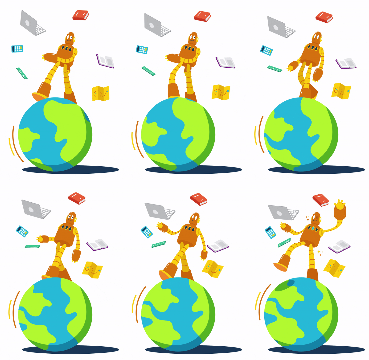
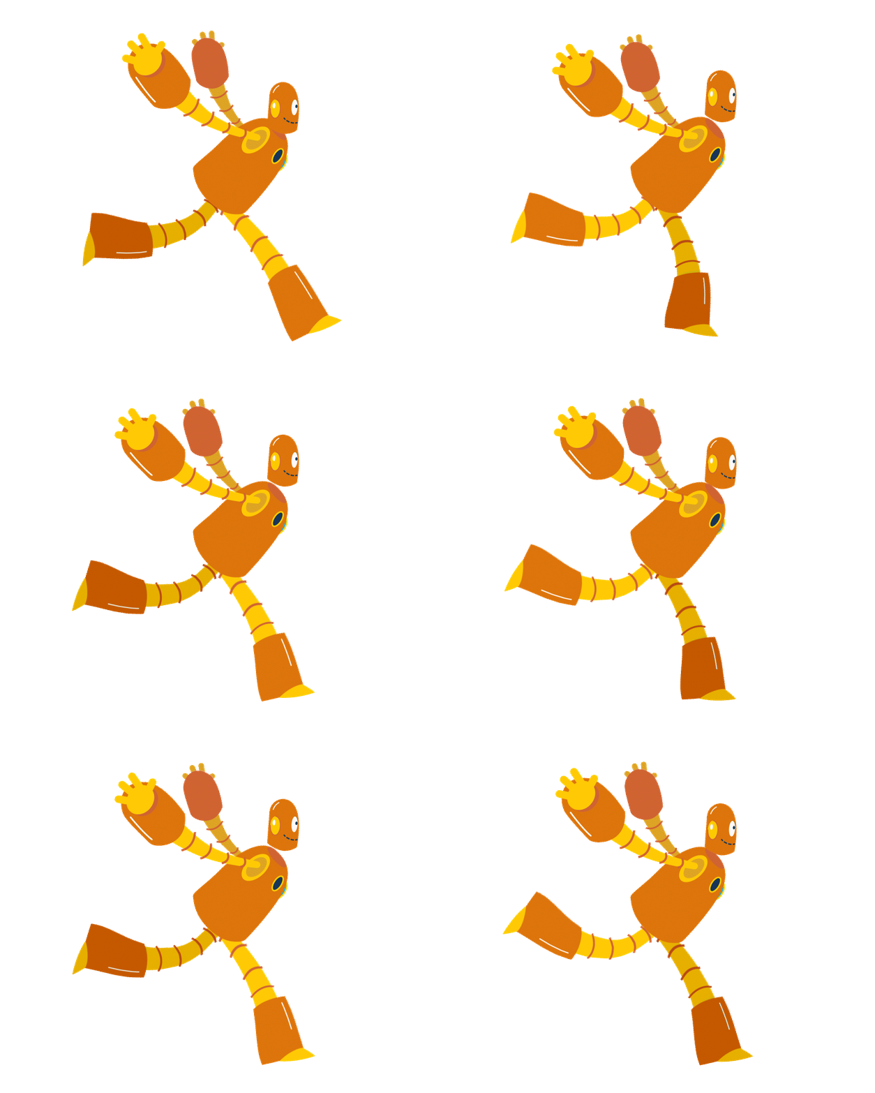
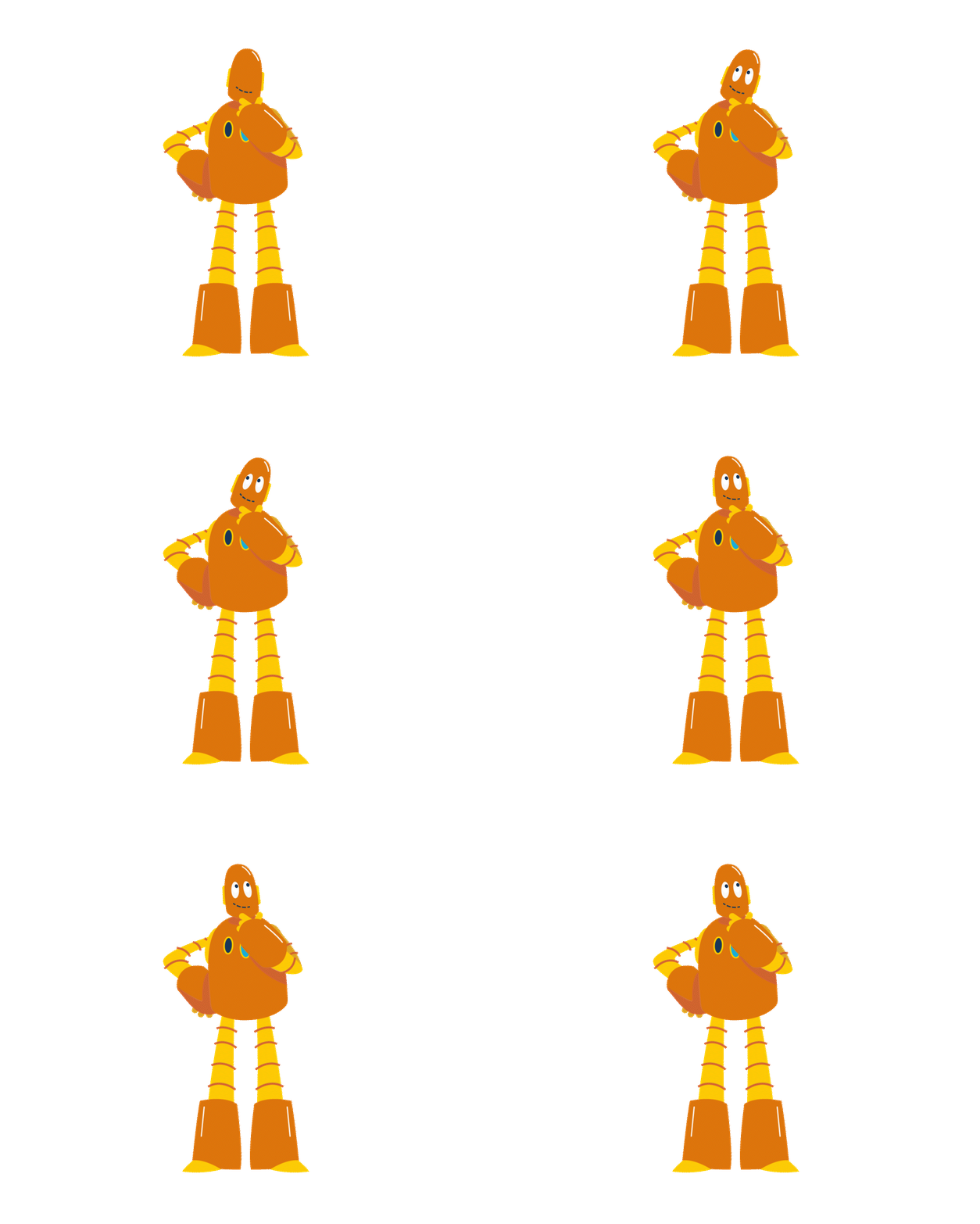
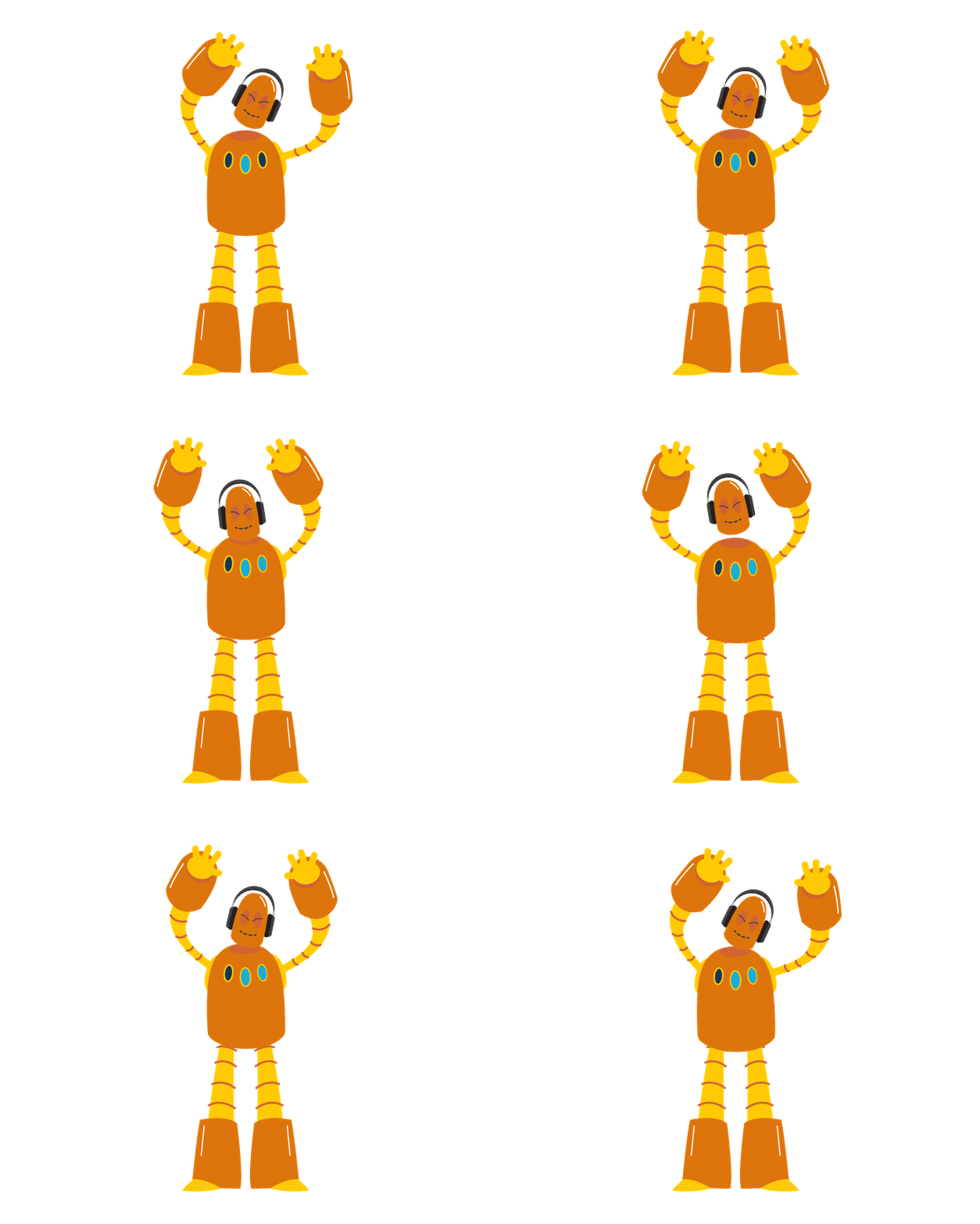
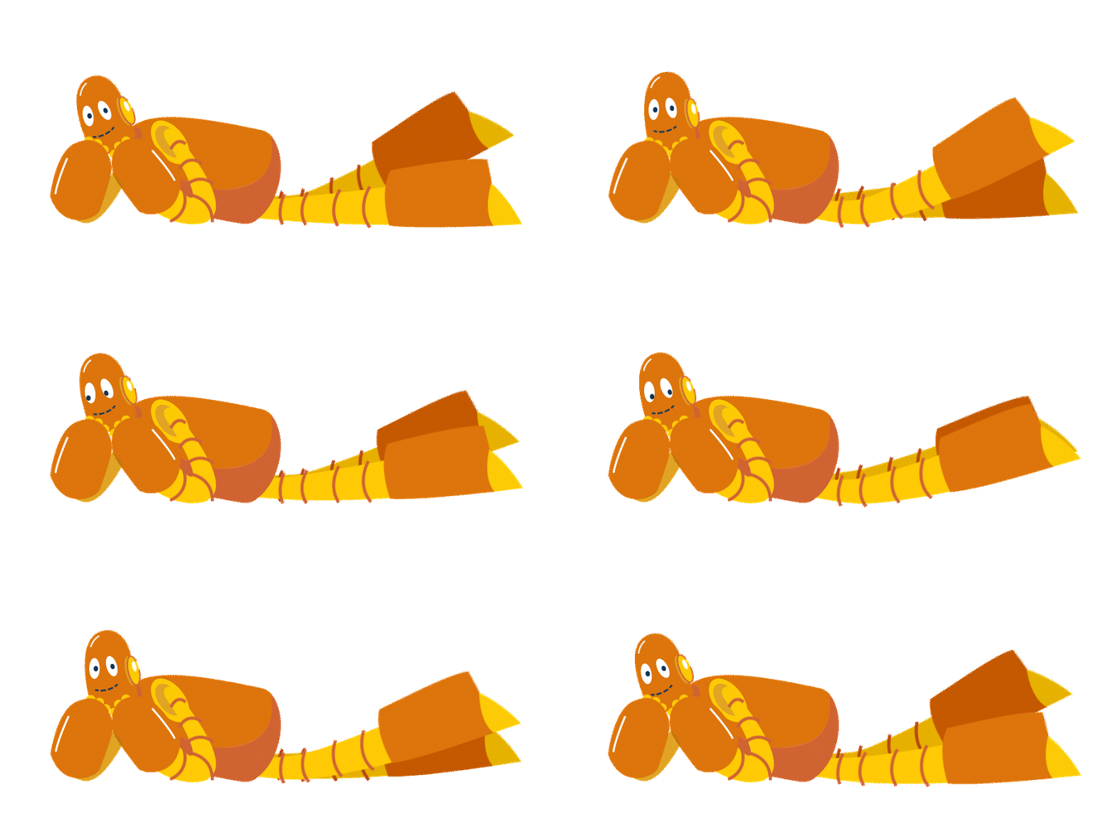
As the company started shifting its brand and product strategy in a new direction, our design team was brought in to help evolve the overall look and feel. That meant updating visuals across the board, and of course, we couldn’t forget about Moby, the company’s longtime and well-loved mascot.
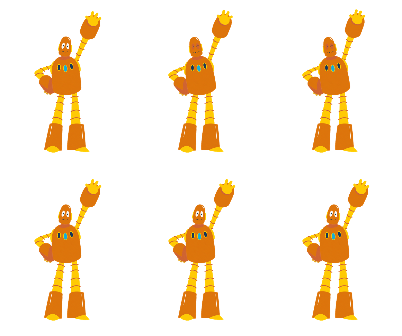
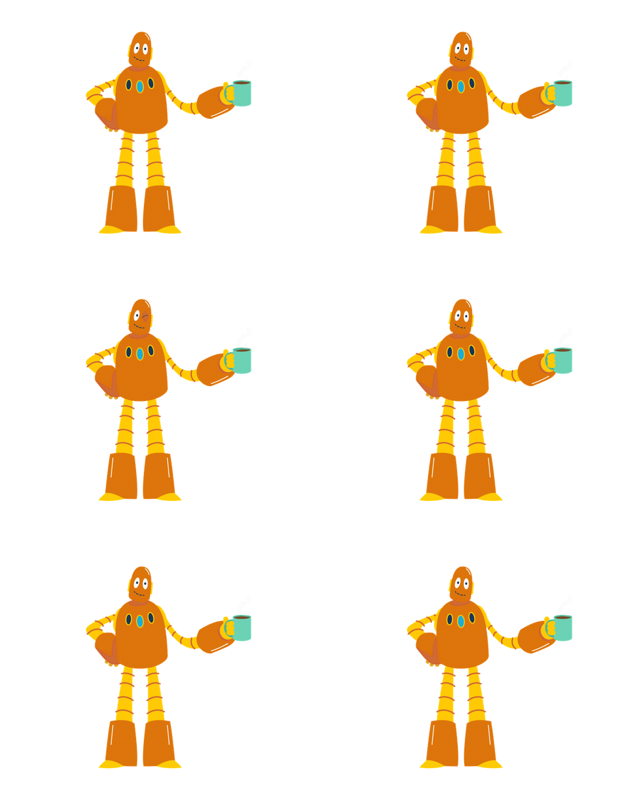
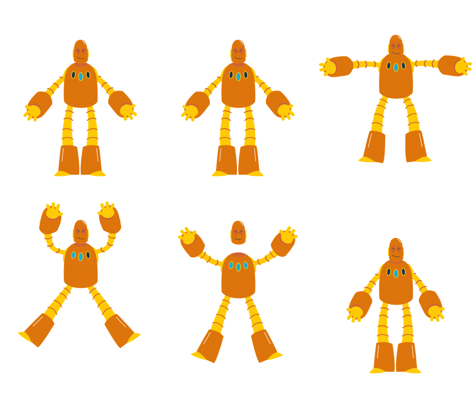
I worked closely with one of the head animators to refresh Moby’s design so he could better represent where the company is headed, especially in marketing and brand storytelling. The purpose was to establish a clearer distinction between BrainPOP as a brand vs. the flagship product, BrainPOP (for grades 3-8).
The goal was to keep him recognizable and true to his roots, but give him a bit of a modern edge to match the company’s updated vibe. It was a fun challenge figuring out how to strike that balance—staying true to what people love while helping push the brand forward.
Updated Product Icons
Along with updating Moby’s look, I also worked on revamping our product icons to match the brand’s new direction. We kept the characters educators and students love but gave them a refresh to reflect the product updates. We also introduced a new mascot for BrainPOP’s science product to tie it all together.
U.Moby in Action
I also had the opportunity to really flex and grow my animation skills! It was a lot of fun thinking about how this version of Moby would move. I wanted his movement to reflect the ‘re-energized’ look-and-feel we’ve developed that still speaks to his playful personality. A combination of Adobe Illustrator and After Effects was used to create these.
FETC 2025
Booth Design
I was responsible for designing our booth for FETC 2025. As BrainPOP was undergoing a preliminary brand refresh, the goal was for the new booth to serve as a visual bridge to the company’s evolving look and feel. I incorporated our existing illustrations and color palette while creating new lock-ups to add depth and evoke a sense of familiarity. I then created a 3D mockup of what the booth would look like in situ. [Blender]
Editorial Illustrations
I was tasked with developing an illustration style and creating key art that would live in a resources hub alongside highlighted blog articles. My goal was to infuse a sophisticated ‘editorial’ look while still maintaining the brand’s personality by using pieces of the company’s beloved robot mascot [Moby] in a playful way.
You can also see the seeds of the brand evolution being planted here!
Marketing Email campaigns
Email designs for BrainPOP’s campaigns during Earth Month, Digital Citizenship Week and some pre-rebranding promotional emails for their science product. I developed illustrations and lockups that spoke to each campaign’s narrative while also maintaining BrainPOP’s warm and fun personality.
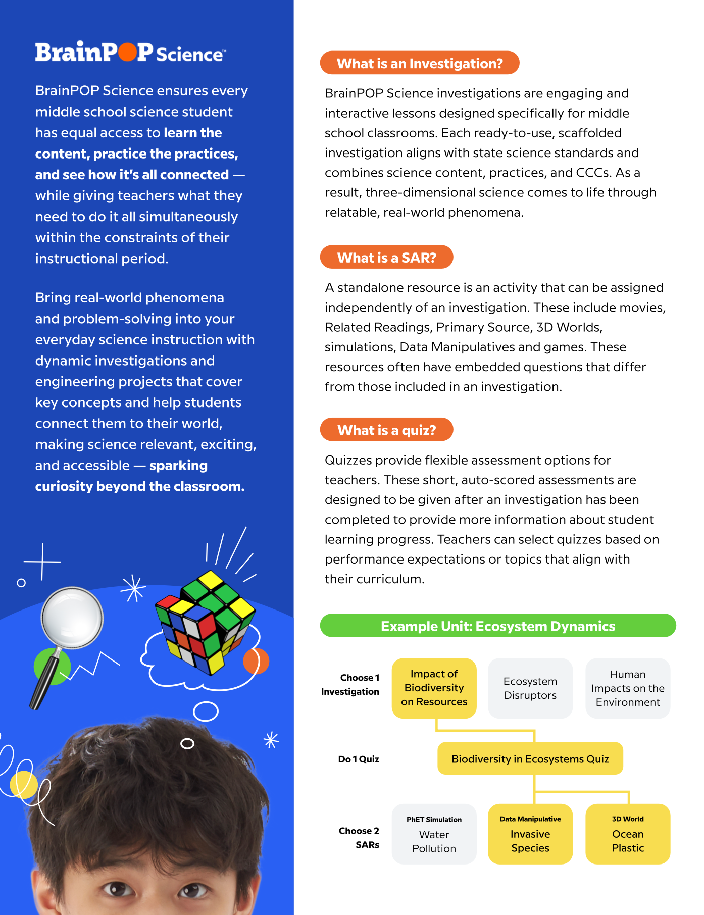
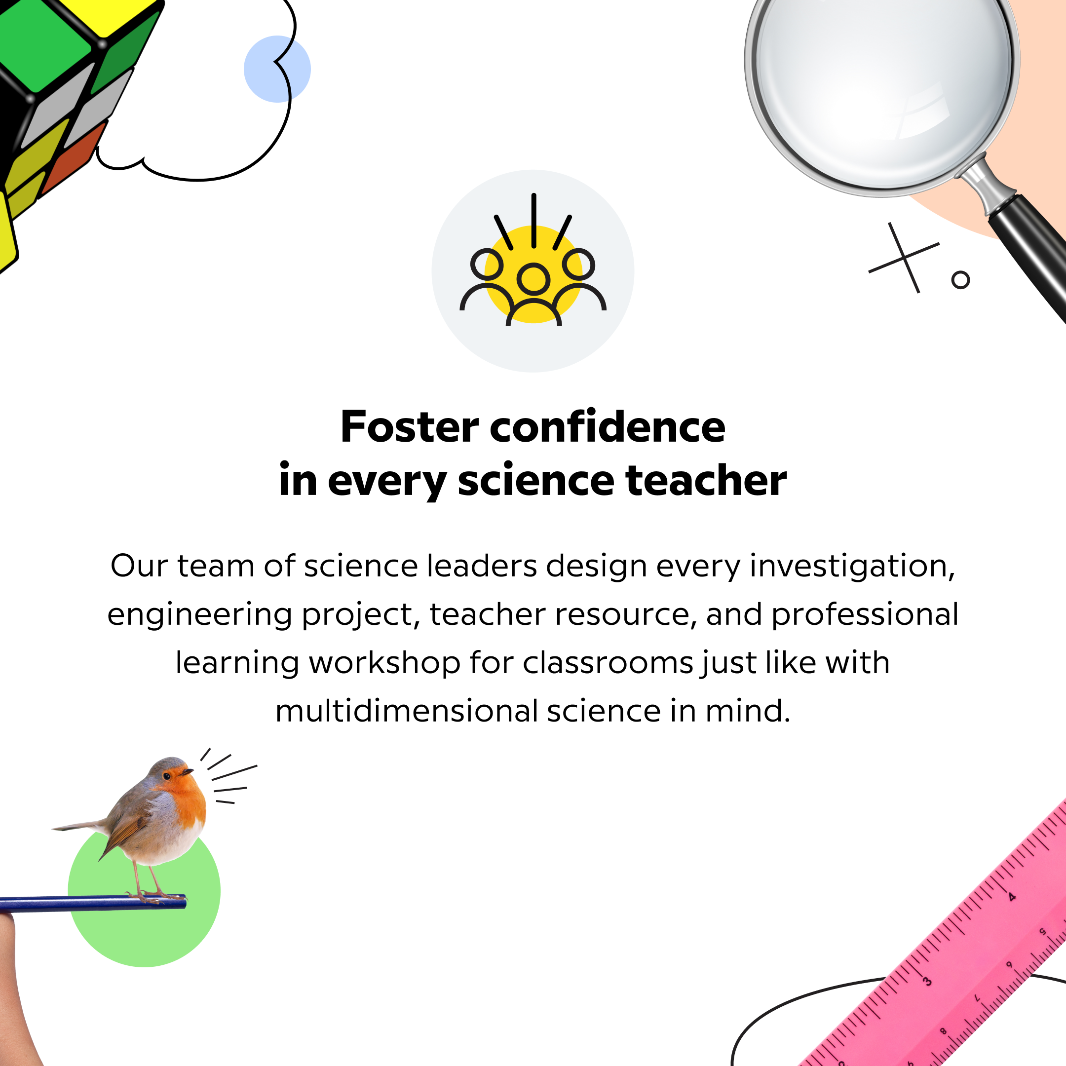
BrainPOP Science [Rebrand]
Under the guidance of BrainPOP Science’s head designer, I helped create a consistent visual language that would be implemented across the product’s promotional materials.
My main focus was to highlight the product's mission of showing how science is everywhere and how it helps make science engaging and approachable for students.
Discipline Site Pages
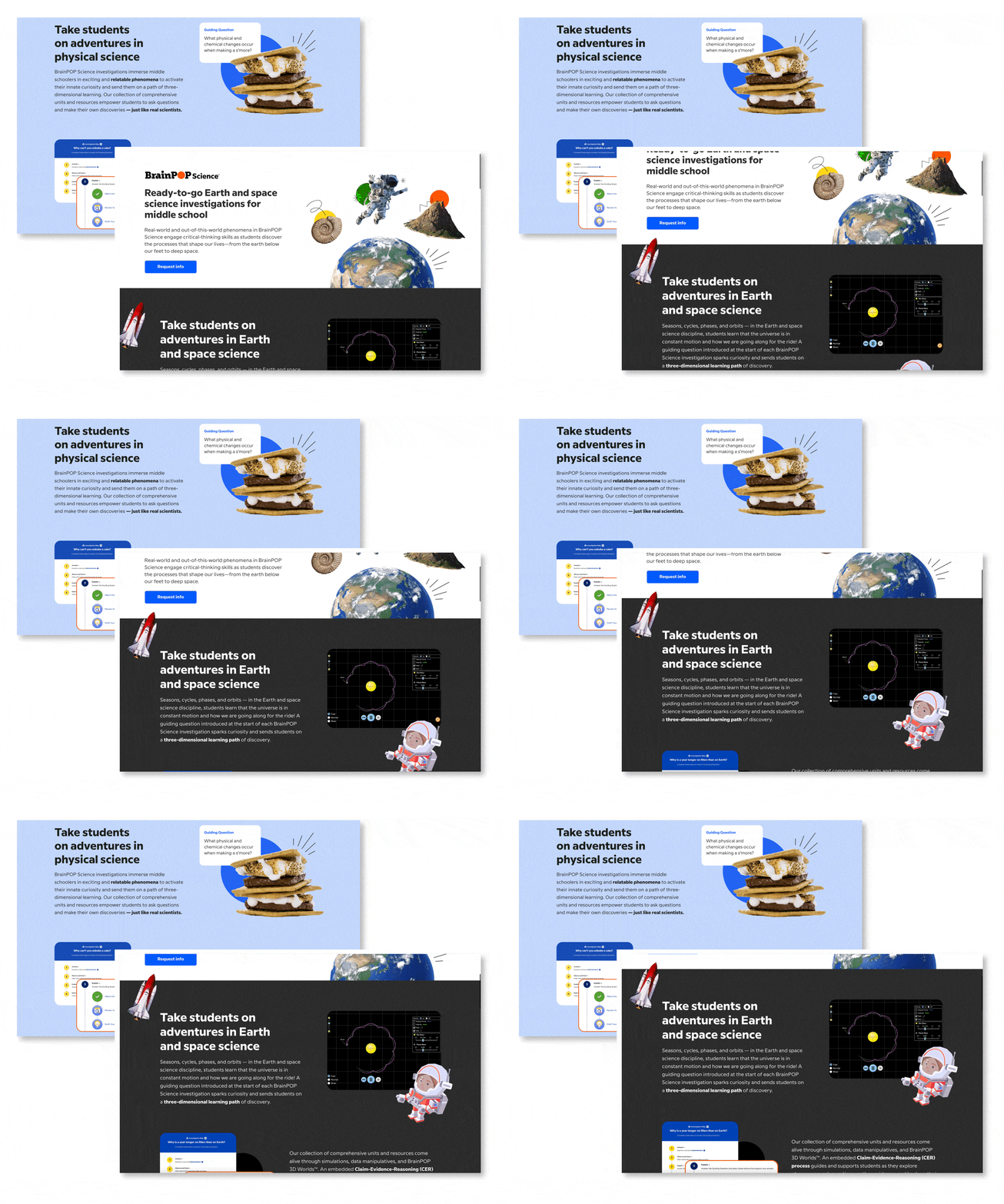
With the new branding in place, I redesigned the science product hubs for life science, physical science, and earth and space. My focus was on creating a user-friendly and visually engaging experience that highlighted the content effectively.
The goal was to balance interactivity with the extensive content the team wanted to showcase. To address the challenge of organizing units and topics, I implemented a hover-over function, keeping the design clean and preventing overwhelming amounts of text.

